Published on August 5, 2005
Director's Commentary
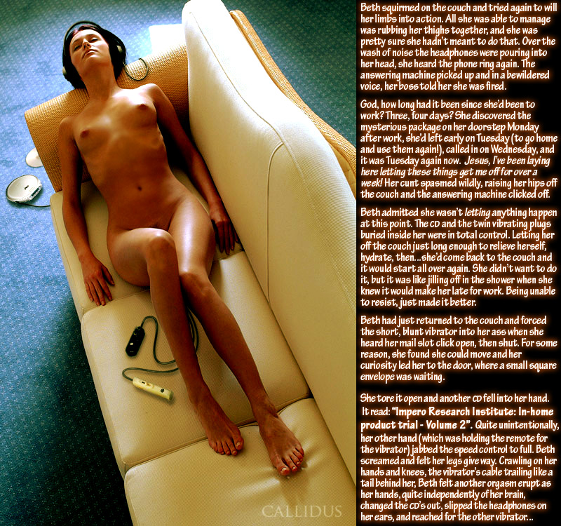
This image is a total dichotomy in that I’m very pleased with the composting work I did (every one of the props was added) and I really like the story but…I’ve always felt the base image itself didn’t convey the erotic heat that the story did. To this day, I’ll come across images that I think “That would’ve been a better fit for that story.” So on the one hand, I do like it, but I can’t help feeling it could’ve been executed better.




2 Comments
James
Is hypnotic sex real…
Wulfedrachen
Good God, she is stunning! What a beautiful woman!